
The poster is for a NETFLIX series that goes through and explores the lore and reasoning and truth behind the suicide of a girl named Hannah and the story gets progressively deeper as more secrets are raveled
The colors are dark and gloomy which creates meaning that things are dull, depressing and unclear this is reinforced by the fact clay’s (the boy) face is blurred out as the poster focuses on Hannah’s face.
The Polaroid in my opinion shows that there is something that is being focused and and is in the center of the poster which means to me it is the center of attention and as i would describe a “mask” that’ s maybe hiding something underneath.
ANTI BULLYING
Bullying UK: Bullying advice
Bullying – Young Minds
Anti-Bullying Alliance | United against bullying
Here are some websites that give an insight on bulling the effects it has and how to be dealt with.
ACAS – Advisory, Conciliation and Arbitration Service
Helpline: 0300 123 1100
Bullying UK (Part of Family Lives)
Helpline: 0808 800 2222
These 2 helplines are for general bullying and bullying at the workplace or place of education.
3 posters/leaflets of bullying

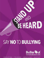

they are targeted towards kids and teens because of the bright contrast in colors and the short strong factual phrases used to shame bullying and encourage you to stand up for yourself and others.
the colors in each on are either dark and gloomy or fade into darkness which in my opinion shows something concerning or serious is being spoken about or represented.
the layout of each one is to have a big title and words and saying scatted about this is to fill the poster up and for someone to have a quick read as a friendly reminder to e nice rather than a formal introduction to why bullying should not happen.
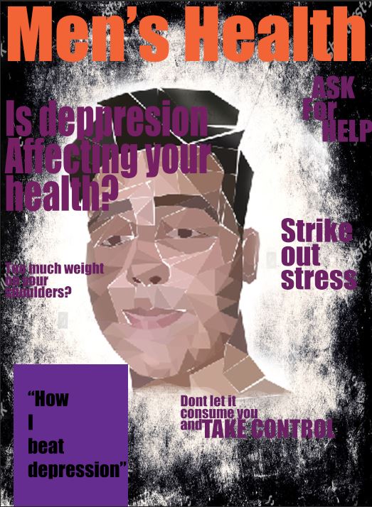
In evaluation, i complete my bullying poster and managed to emphasize a message throughout it with having minimal words.
I designed the way i did because i wanted the words scatted about to represent a racing mind full of thought and taking into consideration every action and sayings.
It is aimed at teens since its has 13 reasons why related to it because it is mature and many teens can relate and understand the story also its aimed and bullying in high school.
I would improve the finishing up on my poster making it look more sleek and having a more constant theme throughout.
 Tommorow i will be doing a photo shoot in the studio to upload to my word press and i will be annylising some more poasters about 13 reasons why saying things such as the emotion convayed beetween the portrait and the polaroid.


i have taken some photos for my poster and while in this shoot i directed the subject to convey happy and sad emotions and directed him to this pose as happy while looking energetic and ready.
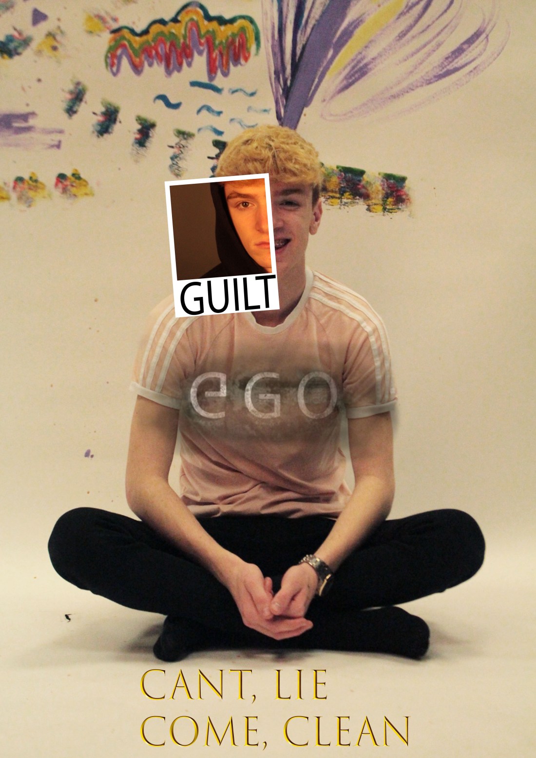 In this poster i am trying to represent a happy and sadness and then the factors that control those feeling as this is a common theme/situation.
I like how there is a bright colorful and contrasted background and theme to the main picture and that the Polaroid matches to his face to display a half happy and half gloomy dark sad depressed face.
